Sunday, February 6, 2011

Blog 5-TEAM Alex and Cliff


Penny Concept

For this dress I was directly inspired by one of my favorite graphic designers, Stefan Sagmiester. One of his works, “Obsessions make my life worse and my work better” he used 250,000 pennies to spell this out. The results are beautiful because of the way the different toned pennies give the letters depth and dimension.

In our rendition, I wanted to get across the message that many people find the penny pointless and for some reason, the government has not come up with a solution to at least make the penny cost effective to produce. On average, pennies cost 1.4 cents to make, making penny production a loss to the government, especially when the US Mint produces billions of pennies annually.

Our communication strategy is to construct a dress strong enough to hold the weight of thousands of pennies. The pennies will either be completely covering the dress, or it will wrap around the dress in an intricate design. To make any type stand out from the rest of the pennies, I will clean the pennies with vinegar, which brings their shine back. We plan on doing some material tests but the plan is to hot glue the pennies on to the dress.

With the bright lights of the runway gleaming on the dress it will reflect off of the pennies giving it a dramatic shine.

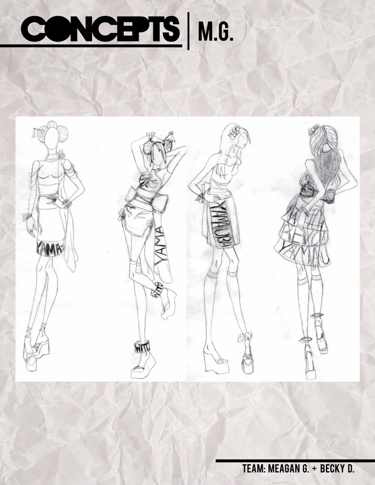
Blog 5: TEAM: Becky D. + Meagan G. Part 2 (Meagan G.)


Blog 5: TEAM: Becky D. + Meagan G. Part 1 (Becky D.)


The Bag Lady - Nadine Bauthamy and Andrew McGinley -- Blog 5

“Bag Lady”


Is it estimated that between 600,000 and 2.5 million people are homeless. What do we know about them? So easy to pretend they do not exist…

Our story is about a day in the life of a homeless person and understanding the challenges they face on a daily basis. By talking to a real homeless person we would like to understand a bit more about their life on the street. Do they have any hopes, dreams? Is there any joy living on the street? Or it is all about fears, dangers, noises, lights, pollution, filth, lack of health care…? His/her story will help us weave the design of this project. We are planning on inspiring ourselves from the textures of the street: plastics, wool, denim, cart/grid, bags filled with stuff… and derive some patterns from collage of materials found on the street, cardboard, handwriting, permanent markers, paint, stencils.


Kari & Sarah-- Blog 5


                                                                Timeless Treasures
    The idea behind the concept “Timeless Treasures” has to do with the memories we acquire in our lifetime and how no matter how old we get, those memories remain the same. In order to portray this idea and give the nostalgic feeling to the audience, I would choose techniques such as tea dying to give the materials a worn look. Also, I think taking ideas such as the use of old letters, frayed or burned edges, and possibly even photographs. The dress should have a modern silhouette since the principle idea is a more antique feeling. I plan on using different textures to create a very tactile look to the dress by using different materials and techniques. I think exploring and researching different surface design techniques will be important to this design. For materials, this dress will be mixed media and will consist of both paper and fabric.

Project 5: Sara M. and LeAna L. Blog 5


Negativity Is Nonsense


            For one of our dresses, LeAna and I decided to stick with my Rwandan theme.  The initial inspiration behind this idea was my sister’s recent study of the topic.  She ignited the idea for me to spread awareness.  Upon explaining my concept to a few friends and coworkers, I found that few knew much or any information at all about the Rwandan genocide; thus, pushed me to pursue the concept even more.  It was a significant event in history that should not go unremembered or unnoticed.
            The nature of the Rwandan massacre was essentially a civil war, Hutus vs. Tutsis, and although they wore everyday clothes in the Hollywood renditions of the event, I immediately think of military-inspired clothing with strong shoulders, buttons, zippers, slim silhouettes, etc.  I also think of strength and power when thinking about military and in my initial concept, I wanted to empower the Tutsi minority that were forced to endure such cruelty from the Hutu majority.
            We decided on tape as the primary material for this dress, specifically duct tape because of the qualities it possesses (strong tact, durability, if you remove it, it leaves a residue – impression).  Although that is subject to change; we are planning on experimenting with different kinds of tape (duct, masking, Gorilla, electrical, etc.) for strength purposes as well as what will accommodate acrylic paint the best.  The plan is to stick with the original painting process because of the bold, saturated colors and the same color palette (red, black, grays) because they are most impactful.  In addition to tape (built on a muslin structure) and acrylic paint, buttons and possibly zippers, will be added to keep with the militaristic theme.  If tape fails, our back-up “fabric” will most likely be an actual fabric that emulates the look and feel of our tape choice.
            The silhouette will be form-fitting with a short-sleeve, collared top of the dress and a pencil skirt bottom.  The used of the Keith Haring inspired figures will be used on the back of the dress (as well as other graphics throughout), because most people respond to images before typography.  As far as typography goes, the phrase "Negativity Is Nonsense" will be our theme and will be used in a similar hand-rendered typeface as the original acrylic painting; but with cleaner lines to make it more legible.  The placement will start at the shoulder, continue on past the breast and detour to the back right before the hip.  The reasoning behind this is to immediately grab the attention of the viewer to spread the important message of awareness.